In this article, we will be discussing how to read and interpret different patterns of burndown charts in JIRA.
Video tutorial on burndown charts
What is a burndown chart? #
- The burndown chart represents how much work is pending for the remaining period of the sprint.
- The burndown chart lets all the stakeholders know if the team is comfortable for this sprint or needs immediate attention.
- The burndown chart signifies the graphical view of how a scrum team is performing during the sprint.
- The burndown charts are a powerful mechanism to view your team’s general behaviour when observed over a few sprints.
BURNDOWN CHARTS – remaining effort over the given period
How to navigate to burndown chart in JIRA #
Click here to know how to navigate burndown charts in JIRA.
Basics to read burndown chart in JIRA #
It is quite easy to read burndown charts. Refer to figure 1 for the sample burndown chart in JIRA.
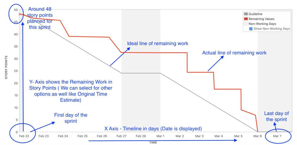
figure 1
X-axis - Timeline of the sprint, generally in days (refer to figure 1)
Y-axis – Effort, generally in story points (refer to figure 1)
Ideal Line of Remaining Work - This shows the perfect path when burning the daily effort.
Actual Line of Remaining Work – This shows what is happening or happened during the sprint and how much remaining work is pending.
Interpret burndown charts in JIRA #
In this section, we will be discussing a few patterns to interpret generic burndown charts.
Burndown chart with steep drops : #
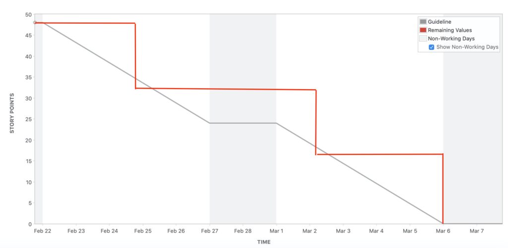
figure 2
A burndown chart with steep drops means that probably the work has not been appropriately divided by the team. This chart also shows that very few stories, probably only 3, account for all the 48 story points.
Burndown chart with an actual line close to the ideal line : #
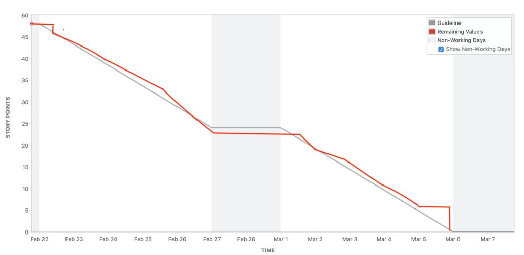
figure 3
During the sprint, such a burndown chart shows that the team has been doing well. The ideal line is very close to the actual line. This burndown chart depicts that the team is comfortable during the sprint.
Burn down chart with actual line lower than the ideal line : #
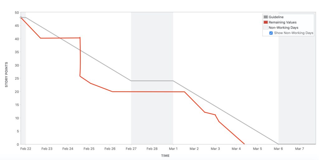
figure 4
Burndown charts with an actual line lower than the ideal line depict that the team has completed work before time, or if they are in the middle of the sprint, they will be able to complete work ahead of sprint closure.
Once in a while, such a chart shows is a good signal. This chart shows that the team is doing an excellent job in completing the work before time.
This chart reveals teamwork and understanding of the project, but if the pattern is consistent, something needs to be looked into the team. Maybe the team is pulling up work much less than their capacity.
The team either needs to pull up more work, or the team needs to reconsider the sprint duration.
Burndown chart with actual line drops just the last day: #
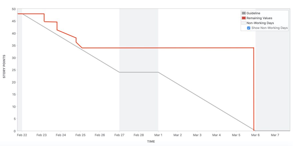
figure 5
This burndown chart shows that the team needs to learn how to update the tasks regularly. The team is not updating their tasks every day and doing the job just before the sprint ends.
Probably work got piled up until the end of the sprint; there was a rush to get everything completed in the end.
Another alarming point can be that updating the burndown chart is not realistic. Whatever may be the case, a retrospection is required here.
Incomplete Burndown charts: #
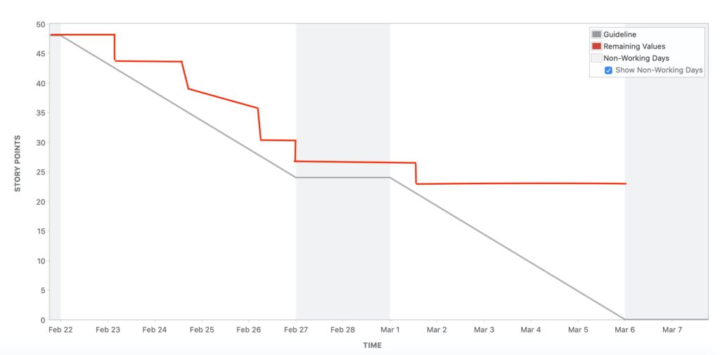
figure 6
This burndown chart shows that the team could not complete work on time, and some of the tasks were left undone. The burndown chart shows that things were ok until the first week, but after that, the team started facing some issues, and until the end of the sprint team could not finish the sprint backlog.
Burndown chart with arching curves #
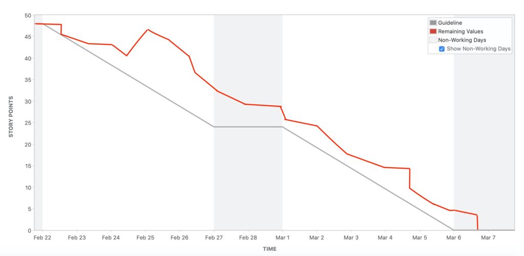
figure 7
This burndown chart shows that the work started usually and the things were in control by the team, but on the 3rd day more work was added. Though the sprint scope has changed, the team did ok, and the team managed most of the tasks.
If we note in the chart, it seems that team has been working on the non-working days as well.
We hope this article helps in building an understanding of reading burndown charts in JIRA. Good Luck !!!